When I first joined Script Revolution, I was eager to learn how to design movie posters for my scripts. It’s awesome to have the opportunity to showcase all of my skills. I figured, I have over twenty years of computer graphic design experience. I got this.
Well, as it turns out, designing movie posters requires a slightly different creative process. The biggest block is when the movie doesn’t exist yet. No actors have been cast. I don’t have professional photos. I got nothing.
So here’s all I’ve learned along the way, so I could design posters for unproduced scripts.
Develop Your Concept
When I first started exploring this wild and wacky thing called screenwriting, I just had a bunch of ideas. No developed concepts. I’ve long since concluded when the concept for the script is underdeveloped, designing a poster is problematic. Not impossible, just…not good enough.
It’s really hard to show a visual of anything that doesn’t actually exist yet.
I know. You’re a writer. You have a vivid imagination. The story is one hundred percent real to you. Why can’t everyone see that? Because no one’s a mind reader. People can’t see what’s in your imagination unless you show them.
How do you show them? By developing your concept. Read. Books, scripts, and articles. Read everything. Learn to develop your concepts.
I realize this might be a bitter pill to swallow. I’m only showing what I’ve learned from my mistakes. Develop your concept first, and everything, including designing a movie poster, will be much easier.
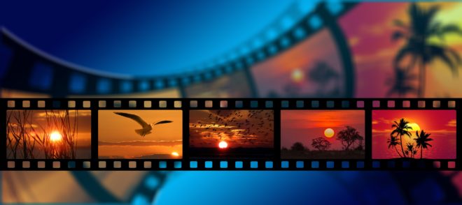
Stock Photo is Not Photography
Which I already knew. Many times I’ve used the stock photo a company bought to work on a variety of designs. I know how it works. Highest quality stock photos are the only ones that can be used. Everything else is useless.
However, I found myself in a different world when I looked through stock photo websites. Many uploaded stock photos are of such low quality that I couldn’t use them. I’m still surprised all the time. Don’t these uploaders realize that a low-res snapshot they took with their phone is just pixelated garbage?
On the plus side, I’ve also seen amazing art, ranging from photos of stunning sunsets to 3D art so realistic that even I couldn’t tell it was computer generated. So keep searching, because good art is out there, even if you’re on a budget.
Affordable Art for Movie Posters
This is the main point of the article. How to find affordable art, whether free or paid? It is possible. There are a couple of things to keep in mind.
First and foremost, people who upload stock photos to any website have no way of knowing that someone, somewhere on the planet, is going to search for an exact image at some point in the future. The chances of finding specific stock photos that look exactly the same as what you see in your head is very low.
Which brings me to the second thing to consider. As long as your chosen art represents the overall feel of your developed concept, that’s all you need. Keep an open mind. Merge concepts if that’s the only image you can find.
All but one of my movie posters use free stock photos. Shocked? It’s okay. I’ll give you a second to recover.
You can see all my posters here.
Recovered? Wonderful. Point number three, and I say this as a visual artist. Artists are notoriously bad at describing visuals with words. Have you noticed famous art in museums called untitled? There’s a reason for that. Visual artists think in images, not words.
You may have to spend a lot of time searching pages on stock photo websites. I search based on general concepts, colors, themes, and I might find something useful on page five, if I’m lucky. With free or low-cost art, that’s just how it is.
Layouts Challenge
I’ve been using the golden ratio layout for years. It’s an old, tried and true layout based on a mathematical equation. For the record, I have no idea how to do the equation. I just know how to follow golden ratio. However, I’ve found time and again that golden ratio is rarely useful for movie posters.
Instead, I’ve concluded that simply centering all content with a clear, readable font is best. So long golden ratio, it was nice while it lasted. Hello, the magical world of movie posters.
Do you want to know more about everything I do? Check out the FAQ / Contact page.
Views: 35